Amayi
A calm iPhone app for mothers of young children. Product design, brand, copy and audio. 2026.
Role: product design, visual design, copy, audio, iOS build
Platform: iPhone, on the App Store since August 2026
Made as: founder and sole designer

Why me
I am the user. When I became a mother I had prepared for the sleepless nights. What I did not see coming was the loneliness, and the quiet weight of holding it together when no one was looking. It took years of learning to regulate my own nervous system and finding the small practices that brought me back to myself. Amayi started as a question: what would I have wanted in the hardest stretches? Then I built it.
The problem
Wellness apps assume time and quiet. A mother of a two year old has neither. She has one hand free, a child on her hip, and about three minutes before something needs her again. Most of what is out there was designed for a different life.
Assume ten quiet minutes, eyes closed, headphones on. Sessions are built as a course to complete. Several of the mothers I interviewed had tried one of these apps and stopped using it.
Assume a streak, a routine, and time to type. Missing a day reads as failure.
Assumes she needs more advice. It speaks to the child’s needs, rarely to hers.
Research
Before any screens I ran a short discovery round: five interviews with mothers of young children in June 2025, about three and a half hours of recordings, an affinity diagram of what they said, two personas with empathy maps and journey maps, and a page of How might we questions. Three of those questions shaped everything after. How might we make the interaction short but effective. How might we invite a mother to seek help in the app. How might we make the interface emotional, friendly and trustworthy.
What I heard
Late afternoon is hardest for most
She is tired, and dinner still has to happen.
A few minutes at most
Anything longer feels like one more task.
Text before sound
With kids around, there is rarely a moment for audio.
Praise alone falls flat
She wants to hear that this is hard, in words that fit her day.
The same line gets tuned out
It has to be new each day.
The good ones are worth keeping
When one lands, she wants to find it again.
The personas held the two ends of the same season. Ashley, 42, works part time, two kids, Got it together. Sofi, 38, at home with three, It’s really hard. The app had to work for both: one wants reassurance she is doing it right, the other needs a way to steady herself at four in the afternoon.


The insight
So the app never shows a library. She says how she feels, and Amayi hands her one thing: an affirmation or a grounding practice written for that moment. Three minutes by default, and she can end it whenever the day interrupts.
Design work
From paper to prototype
In October 2025 the first flow was twelve paper sketches: an opening animation, home, three questions, a loading page that asks for a deep breath, the affirmation, practice, reflection, save and share. They became grayscale wireframes, then a clickable Figma prototype in the first palette. That prototype is what went in front of testers before a line of Swift was written.


Two doors, then a short check-in
Home asks one question: what do you need today? Affirmation or Grounding. The check-in behind each door is three taps at most. Eighteen feelings for the affirmation path, fifteen body sensations for grounding, and a short list of what she needs to hear: reassurance, permission, patience, steadiness. She can pick up to three, or Something else.
Getting the lists this short took the most editing. Every option had to be a word a tired person recognizes instantly, not a clinical label. A free text field and voice input sit underneath for anyone who wants to say more, and both are optional.
One sentence at a time
The practice screen shows a single sentence in a large, soft serif with nothing else competing for attention. The affirmation repeats until the timer ends, with nine seconds of silence between repetitions. I started at three and a half seconds. On the device it felt like a stuck record hurrying back, so it went to seven, then nine, all tuned by ear.
The timer runs from one to ten minutes, with a No timer option. The app deliberately does not remember the last choice, because the right length depends on the day, not on habit.


The audio
Reading is hard when the eyes are tired, so every practice can be read aloud. I chose the voice by ear after the polished synthetic options kept sounding like an ad. The service’s own pauses last under a second, so the app holds the silence itself: seven seconds after a full breath, four after an in-breath, five after something to do or notice, three after a reassurance.
Under the voice sits one of thirteen ambient tracks, a different one each session. For grounding the music dips while she speaks and rises in the pauses. For affirmations it stays level, because the rise and fall drew attention to itself.
Community, kept quiet on purpose
Other mothers in the same season matter, but a feed can become another place to perform. So Community is a tab, not the home screen. There are no like counts and no most popular sort, only three personal views: Recent, Resonated, My posts. Posting anonymously as A mother is one tap.
The home tagline, You don’t have to hold it alone, links to Community quietly. A door, not a call to action.

Visual system
Warm blush and cream backgrounds, sage for the one button that matters, mauve text instead of black. Ysabeau Infant for everything, with a serif italic reserved for the tagline. The tone of voice is a warm, steady friend who sits beside you, never above you. No dashes, no capitalized labels, no exclamation marks.

Light and dark, both low contrast on purpose. The dark theme is a deep plum rather than black, so a screen at 3am does not glare.


The wave came first. Dozens of wordmarks tried it over, under and through the name before it settled above a low, rounded Amayi in mauve. The app icon is the same wave on its own. The first Figma palette was sage on cream with a muted purple; the shipped app kept that family and warmed it.
Testing and iteration
After the interviews, three kinds of testing shaped the app: a prototype test, a beta before launch, and my own use on the phone. Most of the tuning happened on the phone, not in a design file.
What testers said about the prototype
In November 2025 five mothers tried the Figma prototype through an online testing tool, and I watched video of each one using it. It gave six findings, each with a priority. Three of them changed the product:
Community was hard to find
Priority 0. Testers could not locate Community. It became a tab in the bar, and the home tagline links to it as a second door.
They tapped the emoji, not the slider
Priority 1. Feelings were a slider beside an emoji, and people kept tapping the emoji. The shipped check-in is a grid of feeling chips you tap.
The loading pause felt good
Priority 2. Testers liked the short wait while the affirmation loaded and wanted something to do in it. The generation screen now asks for a breath and shows a slow wave.
The other three asked for clearer instructions on the first question, energy level words that respond to a tap, and a home image that can be tapped.
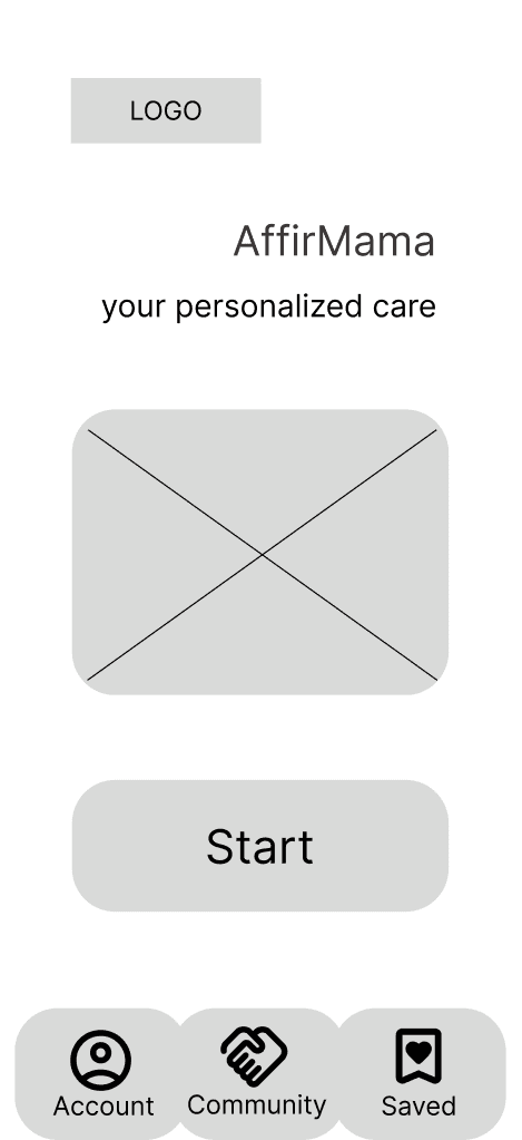

The home wireframe before and after the test. Community got a heavier tab. The working name then was AffirMama.
What changed after shipping
The parenting approaches step had 65 options and no way out. It excluded mothers who recognized none of them. I added It’s okay to choose none, and a Just speak to me plainly option.
Affirmations looped every 3.5 seconds. On the device it felt like being rushed. The gap went to 7 seconds, then 9, and the music stopped swelling between repeats.
App Review rejected build 29 because the app asked for a name Apple had already provided. Build 30 removed the extra step.
With VoiceOver on, the grounding flow could not be finished: the energy figure and the duration wheel were not adjustable by ear. A full accessibility pass fixed that, darkened the sage button so white text passes WCAG AA, brought fifteen controls up to 44 points, and collapsed the splash animation under Reduce Motion.
Outcome and next
Before launch I recruited 16 beta testers, friends who are mothers, and put out more than 50 TestFlight builds. Amayi shipped to the App Store in August 2026 as Amayi: Affirmations for Moms, in the US and Canada, free with a 7 day trial of Amayi Pro. Four updates followed in the first four weeks: smoother onboarding and sign in, more grounding practices, and better read-aloud audio. New accounts join a small newsletter, Amayi Letters, so I can stay in touch without a feed.
Next I want to see whether a practice gets finished, whether it gets saved, and what mothers write to each other in Community. After that comes a feedback loop on the grounding practices, so the app learns which kinds of practice each mother returns to.


