A site for finding a private tutor. Site map, paper sketches, wireframes and high fidelity screens for desktop and phone. 2025.
Role: UX and visual design, from site map to high fidelity
Format: responsive site, every screen designed for desktop and for phone
Stage: high fidelity done for the main path, seven screens at each width


The brief
A student, or a parent, needs a tutor for one subject, near home or online, at a price they can afford. On a big marketplace that can mean hundreds of profiles, a price you only see at the end, and a message thread before you learn whether the tutor even teaches your subject.
I set myself a small scope: one clear path from a question to a booked lesson, with the four things worth comparing, subject, place, price per hour and a way to talk first, visible before they commit.
Structure first
The site map came before any screen. Six top level pages, and nothing deeper than two levels: Home, How it works, Find tutor, Messages, Account, Contact us. Find tutor branches into location, price and subject. How it works holds About us, Our tutors, Our mission and Become a tutor, so tutors have a door too.
Home
A photo, one button to the search, four featured tutors with their price, and a testimonial.
Find tutor
Subject, location. Results show name, subjects, price per hour, city and Online.
Tutor profile
Photo, subjects, rating, a short About. Two actions: Message or Book.
Messages
A plain thread list with Compose. Talk before you pay.
Account
Payment, account info, password. Boring on purpose.
Paper first
Every screen was sketched twice on paper, once for a laptop and once for a phone, before anything went into Figma. Drawing both at the same time is what kept the phone version from becoming a squeezed copy: the tutor cards stack, the search fields go full width, and the menu moves behind a button.
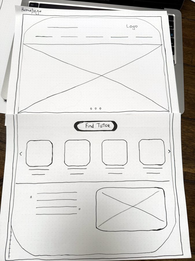


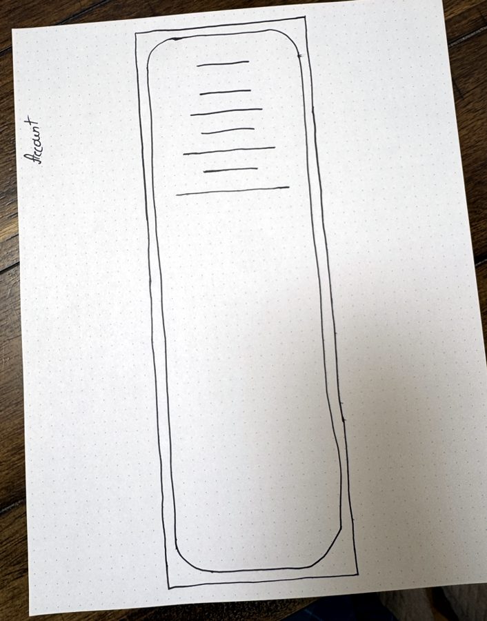

Wireframes, desktop and phone
The wireframes follow one path end to end: Homepage, Find tutor, results, Tutor’s profile, Booking, Confirmation, with Messages alongside. Each exists at desktop width and at phone width, in the same file, so the two never drift apart.
Two decisions show in the grayscale. The search asks only what you want to learn and where you are; every other filter waits until there are results to filter. And the price per hour sits on the result card next to the name, because price is what people compare first and what most sites show last.
Desktop


Phone







Two questions, then results
Subject and place. Not level, not budget, not availability. Those come after, when the list exists and the person has something to narrow.
Message next to Book
The profile ends in two buttons of the same size. A short conversation is often how people choose a tutor, so Message is never hidden behind the booking.
The phone menu
The desktop nav has five links. On the phone they fold behind a menu icon. In the wireframes that was a note to self. In high fidelity it became a real panel.
High fidelity
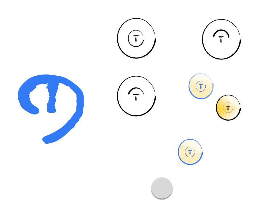
Then the gray became Tutorly. A warm peach page, a blue monospaced wordmark, a round yellow T for the logo, and three buttons: a mint Find tutor, a gold View profile and a white Book with a blue outline. Page titles and the Find tutor button share the wordmark’s face. The rest is a plain sans.
Most screens kept the bones of their wireframe. Two things changed on the way, both on desktop: results gained a Book button next to View profile, and the home page gained a band that says what Tutorly is for.
Desktop, seven screens
Home

Find tutor

Results

Profile

Book a lesson

Confirmation

Messages
Phone, seven screens and the menu


The blob stayed
On paper a wobbly outline stood in for a tutor’s photo. I kept it. In results, on the profile and in Messages each portrait sits in that hand drawn shape, and the testimonial on the home page is circled the same way.
The price never leaves
$40/hr sits under the tutor’s name on the home page, in the results, on the profile and at the top of the booking form. Nobody has to open a profile to learn what a lesson costs.
Booking is a request
Pick a day on the calendar or in the Day and Time menus and press Book. The confirmation says plainly that the tutor still has to approve, and offers two ways on: Message or Homepage.
Same screen, two widths
On desktop a result is a row: portrait, details, View profile and Book. On the phone it stacks into one column and ends in a single full width View profile.
The screens draw on one small sheet: seven color swatches, three buttons and the logo. In the Figma file the type sizes are saved as named styles, with separate body styles for desktop and phone and a layout grid for each. The logo went through a few rounds, some drawn by hand, before it settled on a T inside a yellow circle.

Where it stands and what comes next
The main path is designed end to end at both widths, from paper to high fidelity: home, search, results, profile, booking, confirmation and messages. Still to design are the pages around it: How it works, Account, Contact us, and what happens after Compose.
Next: check contrast on the gold button, where the white label measures about 3 to 1, then build the remaining pages from the sticker sheet.


